Most wardrobes don't have a colour problem. They have an accumulation problem. Every season, a piece gets added in a colour someone else decided was important — a mustard cardigan from a 2022 trend cycle, a forest green jumper from a sale rack, an olive jacket because olive felt safe. Each one fine in isolation. Together, a quiet disaster.
Colour theory in clothing isn't about following rules from a paint chart. It's about deciding what you want a wardrobe to do — and then editing toward that. This guide is for the person who's ready to stop buying things in colours that don't talk to each other.
The argument here is simple. Restraint isn't the opposite of expression. It's the frame that lets expression be heard. A wardrobe built on a tight, deliberate palette doesn't make you look beige. It makes the one statement piece you reach for actually land.
The Real Job of a Palette
A wardrobe palette isn't aesthetic. It's functional. Its job is to make sure that any two pieces you pull from the rail, at speed, on a Tuesday morning, will read as if they were chosen by the same person. That's it. That's the whole brief.
The test for whether a palette is working is brutally simple: pick any two items at random. Do they belong on the same body in the same hour? If the answer is "well, with the right jacket…" — the palette isn't doing its job. It's outsourcing the work to a third piece that has to constantly mediate.
Coherence doesn't mean matching. It means the colours share a logic — usually an undertone, a value range, or a tonal family. A charcoal sweatshirt and a stone t-shirt don't match. They agree. That's all you're aiming for.
Pick Your Foundation: Three Neutrals, Chosen Once
The foundation of any palette that survives more than one season is three neutrals. Not four. Not five with a feature wall. Three.
Why three
One neutral is a uniform. Two is a binary. Three gives you depth without giving you decisions. You get a dark anchor, a mid-range workhorse, and a light counterweight — enough range to build outfits, few enough that nothing fights.
The undertone trap
Here's where most wardrobes fall apart. People treat "neutral" as one category. It isn't. Neutrals split into warm (oat, sand, ecru, chocolate, camel, warm grey), cool (stone, true white, charcoal, French navy, true black), and a thin band of true neutrals that work either way (heather grey, off-white).
Pick one lane. A warm chocolate jumper over a cool true-black tee is the wardrobe equivalent of two people talking past each other at a party. Both are fine. The pairing isn't.
A starter foundation
If you're rebuilding from zero, pick one option from each row, in a single undertone lane:
- Dark anchor: true black, charcoal, French navy, or chocolate
- Mid workhorse: heather grey, stone, or warm taupe
- Light counterweight: off-white, oat, sand, or ecru
That's your wardrobe's gravity. Almost every other decision now gets easier.
The 70/20/10 Rule (Lifted From Interior Design, And Worth Stealing)
Interior designers have known this for decades. Most rooms that feel resolved follow a rough split: 70% dominant neutral, 20% secondary tone, 10% accent. Wardrobes work the same way.
- 70% foundation neutrals. The three colours you chose above. Most of what you own. Most of what you wear without thinking.
- 20% complementary tones. Deeper or lighter versions of the same family — a slate grey alongside charcoal, an ivory alongside off-white. Adds depth without breaking the logic.
- 10% accent. One colour. One. Used sparingly. Earned every time it appears.
The reason this works isn't aesthetic theory. It's signal-to-noise. When 90% of your wardrobe is quiet, the 10% that isn't carries real weight. Wear a burnt orange piece against a sea of beiges and it reads intentional. Wear the same piece in a wardrobe of fourteen competing colours and it reads like another thing on the pile.
Where Statement Pieces Actually Belong
"Statement piece" is a misleading phrase. It implies the piece is making the statement on its own. It isn't. The statement is made by the contrast between the piece and everything else around it.
A better mental model: statement pieces are punctuation. They're full stops and exclamation marks. They give the sentence its shape — but they're not the sentence.
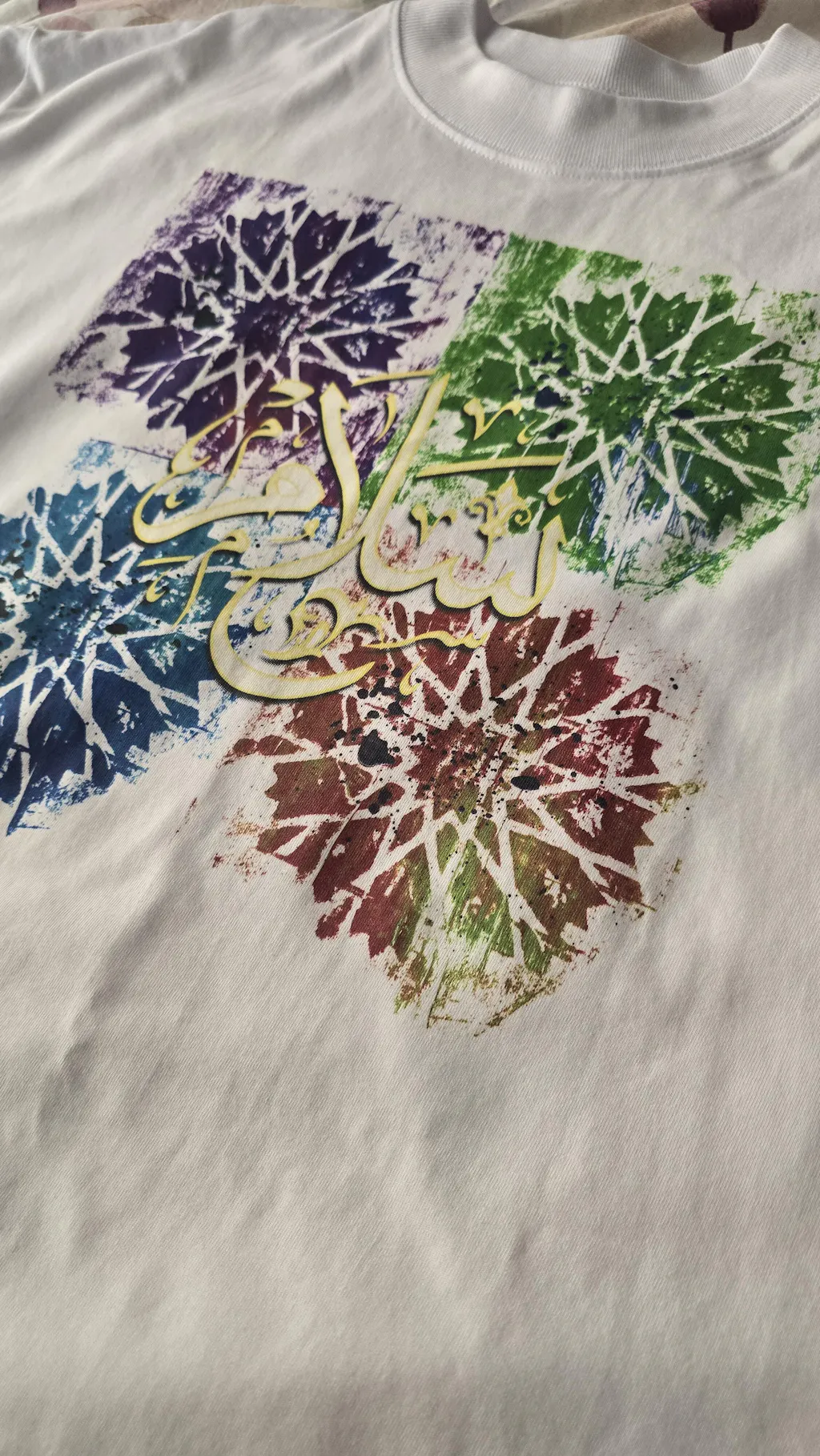
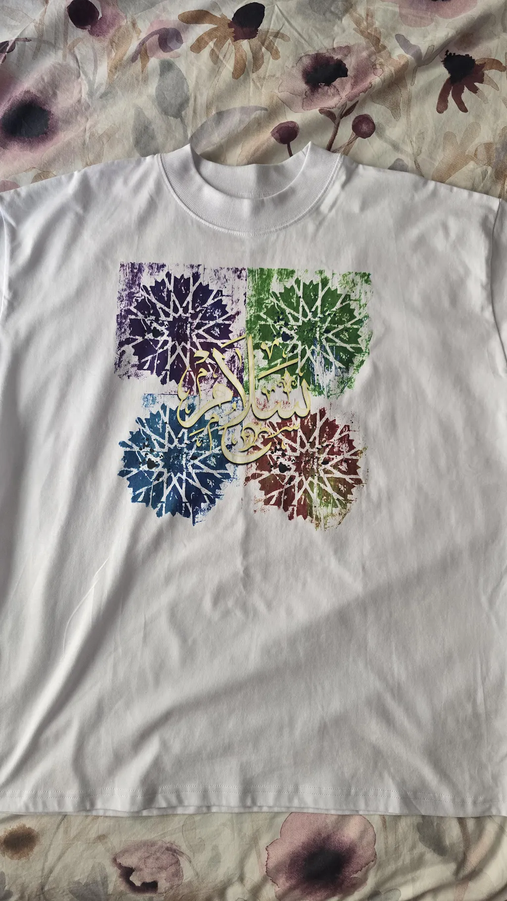
This is exactly where graphic and art-print tees earn their slot. An art tee paired with charcoal trousers, off-white trainers, and a stone overshirt doesn't compete with itself. The print does the talking because nothing else is shouting over it. That's the whole point of building the foundation first.
Two examples from our own catalogue that show the principle. Both are statement prints. Both are deliberately offered in the neutrals you'd already own:
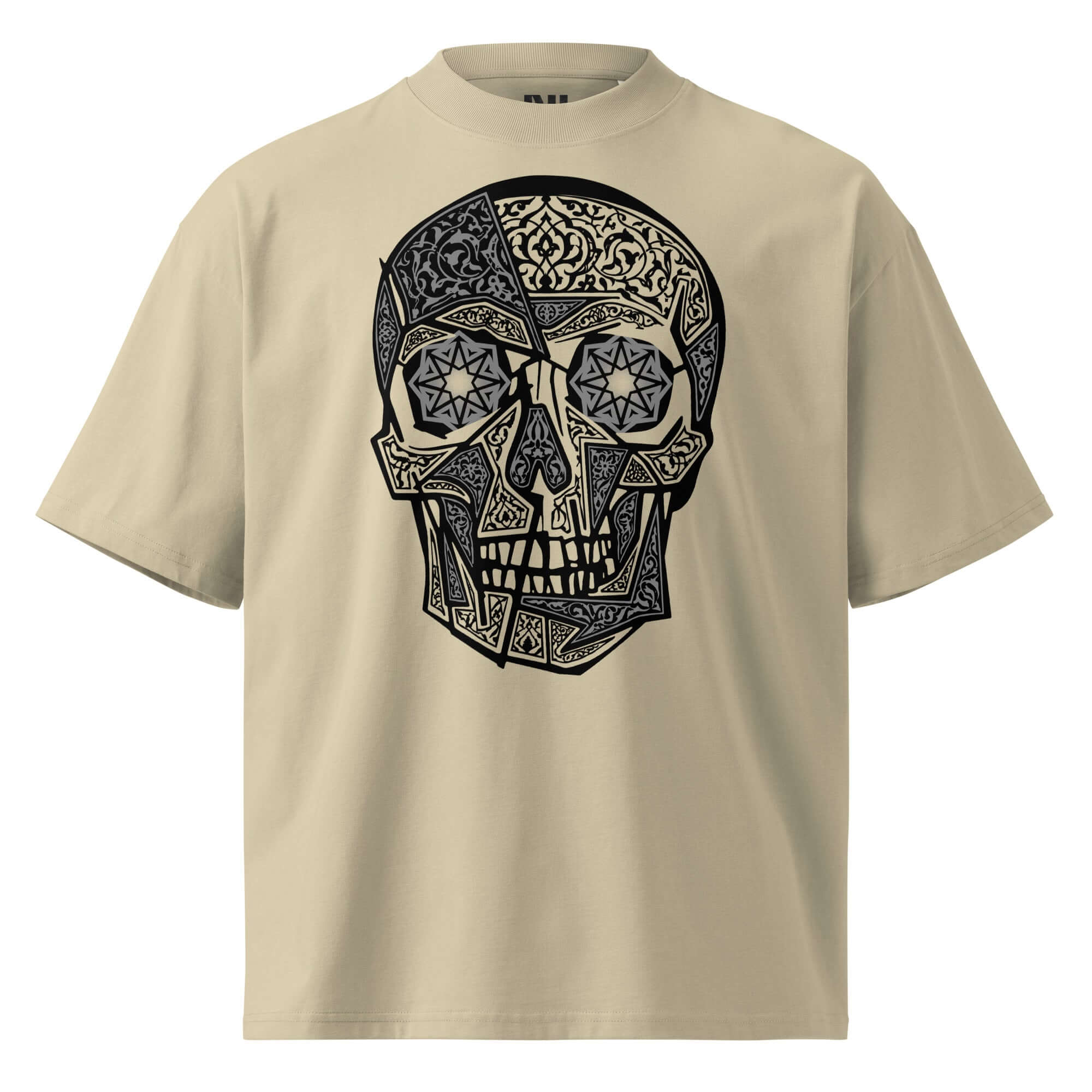
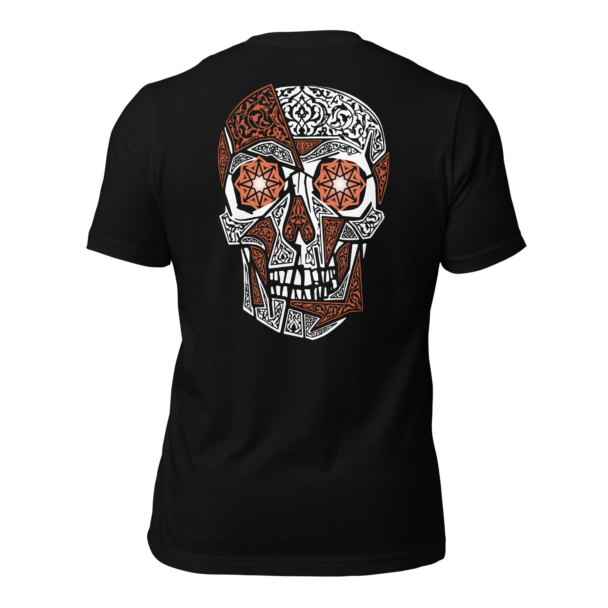
Notice what both of these do: they put the art on garments cut in the same colours you'd already be wearing as foundation. The discipline of the palette doesn't go away when the print arrives. The print joins it.
Fabric Is a Colour Modifier (No One Tells You This)
Here's the thing every colour-theory article skips: the same colour in two different fabrics reads as two different colours. Black in a 200gsm organic cotton tee — soft drape, slight warmth, gentle sheen — is not the same black as a stiff polyester blend. One ages into your wardrobe. The other shouts "new and synthetic" for the entire life of the garment.
Texture and weight do half the work that colour gets credit for. A wardrobe of three neutrals across varied fabric weights — a heavy hoodie, a structured tailored tee, a relaxed oversized tee — reads as far more visually interesting than a wardrobe of seven colours in a single fabric.
This is why fabric quality isn't a luxury concern. It's a colour decision. Buying a stone tee in proper ring-spun cotton means you're buying a colour that will still look like stone after thirty washes. Buying it in a cheaper polyester blend means you're buying a colour that will drift toward dingy beige in three months. The label on the colour stays the s ame. The colour itself doesn't.
Two Mistakes Worth Naming
Buying "interesting" colours one at a time
The single most common wardrobe-killer. You buy an emerald jumper because it's beautiful in the shop. You buy a rust scarf two months later because it's beautiful in the shop. Six months in, you own twelve beautiful colours and three outfits, because nothing was ever bought against anything else.
The fix: buy in groups, against existing pieces. Before you buy any new garment, name three things in your wardrobe it will go with. If you can't, walk away. The piece is asking you to also buy a fourth thing later to make it work.
Confusing fun with expressive
An ironic palette ages fast. The novelty colour you bought because it felt fun in 2024 is the piece you don't reach for in 2026. Expressive choices are different — they say something about you that's still true in three years. The test is whether the colour aligns with how you actually want to be read, or just how you wanted to feel for the afternoon you bought it.
A Practical 5-Piece Test
Try this with the wardrobe you already own. No new purchases required.
- Pull out the five pieces you wear most. Be honest — frequency, not aspiration.
- Lay them on a bed in a single row.
- For each piece, ask: which of the other four can I wear it with? Not "with the right styling." Just — does it work, plainly, with the others?
- Count the working combinations. There are ten possible pairings among five pieces. You want at least seven of them to work.
- If you're under five, the palette is the problem. Not the pieces. The colours weren't chosen against each other.
This test is uncomfortable the first time. It's also the cheapest wardrobe audit you'll ever run.
Build Slowly. Twelve Months, Not One Weekend.
The Pinterest version of a capsule wardrobe shows you a finished result and implies it was assembled in an afternoon. It wasn't. The wardrobes that look that resolved are usually two or three years of one-at-a-time additions, each tested against what came before.
A realistic frame: add one piece a month. Buy nothing impulsive. Before each purchase, lay it (in your head, or in front of the mirror at home) against the three foundation pieces you already own. If it goes with all three, it's earned the slot. If it goes with one or two, you're buying yourself another problem to solve.
The clothes you'll still wear in five years are the ones you didn't have to overthink this morning. That's the whole goal.

One Last Principle
Restraint is not the opposite of personality. It's the surface that lets personality show up. A wardrobe of seven competing colours doesn't read as bolder than a wardrobe of three disciplined ones — it reads as louder. Bold is a different thing. Bold is a quiet wardrobe with one well-chosen piece that means something.
That's the whole argument. Choose three neutrals. Stick with them. Let the rare statement piece do its job. Build slowly. Trust the fabric to do half the work the colour gets the credit for.
The wardrobe you're trying to build isn't the one that wins on a single Instagram post. It's the one you don't have to think about — but that still says something true about you every time someone looks twice.
Start With The Foundation
Our tailored and oversized tees are built on the neutrals every wardrobe should start from — Stone, Heather Grey, French Navy, Off-White, Black. Premium cotton. Considered cut. Art on the back when you want it.
Shop The TeesFAQs
How many colours should a wardrobe palette have?
A working wardrobe palette typically uses three to five colours — usually three neutrals as the foundation and one or two accent shades used sparingly. Fewer than three becomes monotonous; more than five quickly loses coherence.
Is black a true neutral?
Black is a neutral, but a strong one — it sits at the extreme end of the value scale and changes the mood of anything paired with it. A black-heavy wardrobe reads as confident and graphic; for softer outfits, charcoal, midnight navy, or deep brown often work better.
What's the best neutral to start a wardrobe with?
Most people are best served by starting with the dark neutral that matches their natural skin and hair undertone — black, charcoal, or chocolate for cool and neutral undertones, deep navy or chocolate for warmer ones. Add a mid and light neutral that share the same undertone.
How do statement art tees fit a neutral palette?
Graphic and art-print tees work best as punctuation, not the main statement. Treat them as the 10% accent in a 70/20/10 split — a black art tee paired with neutral trousers and shoes lets the print do the talking without competing.
Can I add bright colours to a neutral wardrobe?
Yes, but earn the slot. Add one accent colour at a time and check it works with at least three existing pieces before adding a second. Brand-defining accents like burnt orange or deep blue read intentional; random additions read accidental.
How long should it take to build a lasting wardrobe palette?
Building a wardrobe palette is best treated as a twelve-month project, not a weekend one. Adding one piece at a time, each tested against existing items, produces a wardrobe that holds together — without the impulse-buy regret of a single big haul.