

You've seen "350 " splashed across product pages like it's a medal of honour. You've heard streetwear brands boast about fourteen-ounce as if density alone could make their designs worth wearing. Here's the uncomfortable truth: fabric weight is a tool, not a trophy. The right depends on what that hoodie needs to do—and for graphic streetwear, the answer is more nuanced than "heavier is better."
This guide is for buyers who've done the basics. You know stands for grams per square metre. You know heavier fabric costs more. What you might not know is why graphic prints and bold calligraphy actually behave differently on a 288 g/m² hoodie versus a 400 g/m² slab of —and which weight earns a permanent spot in a UK wardrobe that sees drizzle, layering, and the occasional wash-day reckoning.
We're going to break this down without filler, without hedging. By the end you'll understand the trade-offs, know what to look for, and have enough technical confidence to choose a hoodie that does justice to the design on its back.
The Primer: What the Numbers Actually Mean
measures the mass of fabric per unit area. A higher number means denser material—more yarn, more weight, more insulation. But density isn't the same as quality, and quality isn't the same as suitability.
Industry categories have shifted over the years, but the current consensus runs roughly like this: hoodies sit below 250, occupies the 280–350 range, and starts above 350. Some streetwear-focused manufacturers push the threshold even higher—400 is often cited as the point where a hoodie stops draping on the body and starts holding its own structure.
But these are manufacturing benchmarks, not consumer guarantees. Two hoodies at identical can feel entirely different depending on the knit construction, fibre composition, and finishing. A 300 cotton behaves nothing like a 300. One is denser; the other is loftier. Both weigh the same per square metre, but they sit on the body differently, age differently, and hold graphics differently.
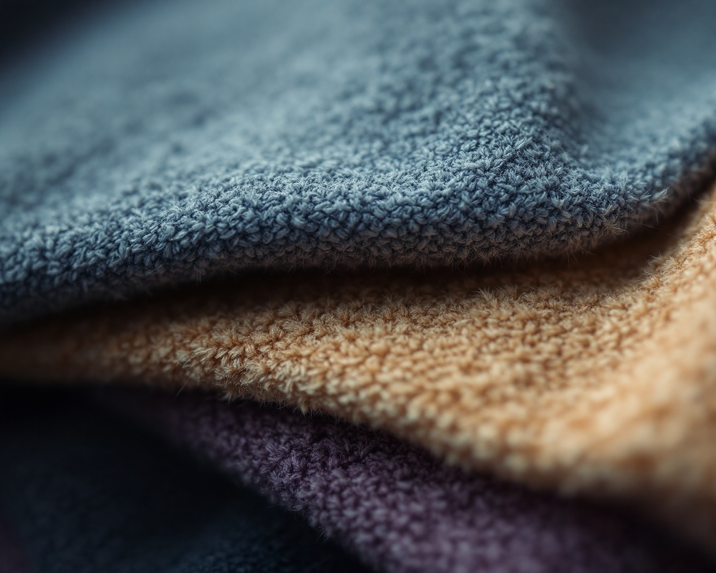
This is where most guides fail: they treat fabric weight as a single axis when it's really a coordinate in a three-dimensional space. Weight interacts with construction and composition. You can't evaluate without knowing what the yarn is doing.
Why Graphic Streetwear Has Different Rules
Here's where things get interesting. Generic hoodie guides optimise for warmth, durability, or price. Graphic streetwear optimises for something else entirely: visual impact over time.
When you print a bold design across the back of a hoodie—calligraphy, geometric abstraction, whatever—the fabric becomes a canvas. And like any canvas, its surface behaviour matters. Too thin, and the print dominates an insubstantial base; the design looks like it was stuck on rather than part of the garment. Too thick and stiff, and the hoodie loses movement; the design becomes a rigid placard rather than a living piece of the outfit.
The sweet spot for graphic streetwear sits in a specific zone that most charts gloss over. You want enough structure to support the visual weight of a large print without the bulk that kills drape. You want density that keeps the print surface stable through repeated washing, but not so much density that the hoodie becomes outerwear by default.
The Technical Argument
Print Adhesion and Fabric Stability
Screen printing and direct-to-garment techniques both rely on the fabric surface to anchor the ink. Denser fabrics with tighter knit structures hold registration better—meaning multi-colour prints stay aligned across production runs. The print also resists cracking because the underlying fabric isn't stretching and shifting with every movement.
But there's a ceiling. Extremely heavy with a loose, textured pile can actually trap ink unevenly, creating inconsistent coverage that looks amateur rather than artisanal. The texture of a 450 brushed can diffuse fine print details, softening edges and reducing clarity. If your design has sharp lines or calligraphic strokes—where precision matters—that texture works against you.
The zone, roughly 280–330 in a cotton-dominant blend, tends to deliver the best print results for graphic work. The fabric provides a stable, flat surface that holds ink cleanly without the textural interference of ultra- construction.
The Case: Why Heavier Isn't Always Better
Let's be honest about when hoodies earn their weight—and when they don't.
A 400+ hoodie is built for cold. It's insulation first, fashion second. The structure that holds a bold graphic also holds heat, which is brilliant for standing around on a frozen touchline and considerably less brilliant for a UK autumn that swings between drizzle and unexpected warmth within the same afternoon.
hoodies also layer poorly. Try to fit a 400 piece under a jacket and you'll find the shoulders bunching, the hood sitting wrong, the whole silhouette going awkward. That bulk which feels substantial on its own becomes a liability the moment you need to build an outfit around it.
Three-Season Flexibility
Sits comfortably under a jacket. Drapes without stiffness. Handles UK transitional weather—September mornings, April evenings, indoor-outdoor days—without overheating. Print surface stays stable without excessive texture.
Cold-Weather Armour
Built for standing still in winter. Holds its own shape. Provides genuine insulation. Works best as a standalone outer layer. Can feel too warm indoors and too bulky under outerwear.
For graphic streetwear in the UK—where the climate rewards layering and punishes single-piece rigidity— construction makes more practical sense more often. You get the structure that supports a bold print without the seasonal limitation that confines a hoodie to three months of actual use.
Composition Matters as Much as Weight
doesn't tell you what the fabric is made of. And composition shapes everything from hand-feel to print longevity to how the hoodie ages over time.
Cotton absorbs ink beautifully. It's why cotton-dominant blends remain the default for graphic work: the fibre structure bonds with the print, producing vibrant colours and clean edges. Pure cotton, however, shrinks. It wrinkles. It loses shape faster than blended alternatives.
Polyester adds dimensional stability. It resists shrinkage, holds colour longer, and maintains structure through repeated washing. But polyester on its own can feel synthetic against the skin—less breathable, less comfortable for long wear.
The 65/35 cotton-polyester blend that dominates the market exists because it balances these trade-offs. You get cotton's print-friendliness and comfort paired with polyester's structural resilience. Ring-spun cotton further improves the surface smoothness, creating a cleaner canvas for detailed graphics.
Construction type adds another variable. has a smooth outer face and looped interior—it prints cleanly and breathes well, but doesn't provide the same insulation as brushed. Brushed runs the loops through wire brushes to create a soft, fuzzy pile inside—warmer, cosier, but with a more textured face that can affect fine print detail.
What to Actually Look For
Forget the arms race. Here's what actually separates a hoodie that works for graphic streetwear from one that doesn't:
Check the Composition
Cotton-dominant blends (65% cotton or higher) give you the best print surface. Ring-spun cotton produces a smoother face than open-end spun alternatives. If the listing doesn't specify, assume the cheaper option.
Understand the Knit
for breathability and cleaner prints. Brushed for warmth and that cosy interior feel. Know which one serves your climate and wearing context.
Match Weight to Use
(280–330) for year-round versatility and layering. (350+) only if you genuinely need standalone winter insulation and don't care about layering.
Examine the Construction Details
Ribbed cuffs that snap back. A hood with actual structure. Reinforced stress points. These details outlast any boast.
The MOEBEER Approach
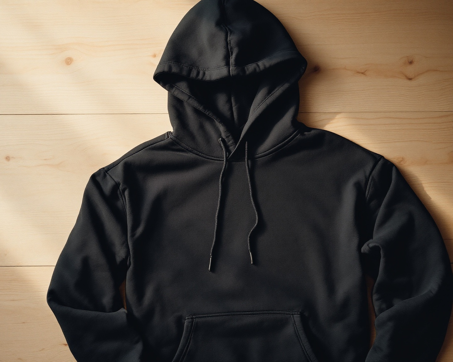
MOEBEER hoodies are built at 288.2 g/m²—squarely in the zone. That's a deliberate choice, not a compromise.
At this weight, the 65% ring-spun cotton / 35% polyester blend delivers a stable print surface that holds calligraphy and graphic work without the textural interference of heavier. The fabric drapes properly. It layers under a jacket without bunching. It handles UK weather—actual UK weather, with its mood swings and its refusal to commit—without turning every indoor moment into a sauna.
The ribbed cuffs on pieces like The Sabr Hoodie maintain shape through repeated wear. The regular fit sits cleanly without the oversized bulk that makes some hoodies feel like wearing a duvet in public.
We're not chasing for bragging rights. We're building hoodies that serve the design and the wearer across three seasons of real use.

The Sabr Hoodie
Arabic calligraphy back print featuring "Sabr" (صبر — patience). 288.2 g/m² ring-spun cotton blend with ribbed cuffs. Regular fit, unisex.
View hoodie
The Salam Unisex Hoodie
"Salam" (سلام — peace) Arabic calligraphy back print. 3-panel hood, kangaroo pocket. 288.2 g/m² cotton-poly blend, regular fit.
View hoodie
The HUB Hoodie
"Hub" (حب — love) Arabic calligraphy back print. 3-panel hood with kangaroo pocket. 288.2 g/m² ring-spun cotton blend.
View hoodieThe Bottom Line
is useful shorthand, but it's only one variable in a much larger equation. Fabric weight matters less than what that weight is made of, how it's constructed, and whether it serves the actual use case.
For graphic streetwear—where the design needs to land visually and the hoodie needs to work across multiple seasons and styling contexts— construction in a cotton-dominant blend outperforms more often than the chasers want to admit.
Choose the weight that fits your life, not the biggest number on the spec sheet.
Ready to see what 288 g/m² feels like in practice?
Shop MOEBEER HoodiesWhat is considered for a hoodie?
Most industry sources place hoodies at 350 and above, though some streetwear-focused definitions push the threshold to 400+. At these weights, hoodies hold their shape independently and provide substantial insulation—but may sacrifice layering versatility.
Is a heavier hoodie always better quality?
No. Weight indicates density, not quality. Yarn type, knit construction, and finishing all affect durability and feel. A well-made hoodie will outlast a poorly constructed one. Focus on composition and construction details, not alone.
What's the best hoodie weight for graphic prints?
hoodies in the 280–330 range typically provide the most stable print surface. Cotton-dominant blends at this weight hold ink cleanly without the textural interference that can affect prints on ultra-.
Can I wear a hoodie in winter?
Yes, with layering. hoodies sit comfortably under jackets and coats, making them more versatile for UK weather than pieces that are difficult to layer. For standalone winter warmth without outerwear, is the better choice.